I’ve been struggling to make sense of — or, more accurately, wisely use — my dad’s matches at Ancestry to extend some of his lines. Dad has one great-grandparent who was born in the U.S.; the others were all born in Ireland (where all but three remained throughout their lives.) So, I’ve long thought most of my dad’s matches are not easily assignable to one of his great-grandparents because there is much I don’t know about the aunts/uncles/first cousins of those ancestors.
Now, that may still be the case to some degree, but I did have an eye-opener when I used the NodeXL template with Excel to cluster my matches. NodeXL is a template for graphing your networks (often in reference to social media) — see here. I found about the tool from reading Shelley Crawford’s blog Twigs of Yore; she has an entire step-by-step series on how to create visual networks of your Ancestry DNA matches using NodeXL and Excel. (An indexed version is here.)
So, I downloaded my dad’s matches at year-end from Ancestry using DNAGedCom, and loaded the data into the NodeXL template. I limited the number of matches to those who share at least 17 cM with my dad; I also did not include my brother or me as matches, nor my paternal 1st cousin.
The reason you want to exclude close matches is because they will match so many people you (or your target person) that there will be connections all over the graph, and you won’t be able to discern any useful information.
For this same reason, I also excluded children and grandchildren of matches, for those cases I know about. (As a disclaimer, just to be clear, with Ancestry’s matches, I have no way of telling if match A and match B are, say, child/parent to each other — unless I personally know A and B, or unless I’ve “met” online regarding our shared matches, and they’ve shared that with me.)
That’s the context; here is the first picture of Dad’s top 1,000 (or so) matches clustered into the top groups.
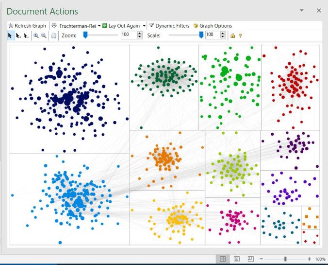
The bigger dots represent the closest genetic connections to my dad. Big dots exist in the navy dot group (upper left), the turquoise group (lower left) and the kelly green group (upper right).
The grey lines denote connections, both within groups and between groups. In one easy glance, one can determine that the group most tightly related to each other is the group on the top row with dark green dots. It looks like a web.
As far as inter-group connections go, the turquoise dot group seems to have the most connections with other groups.
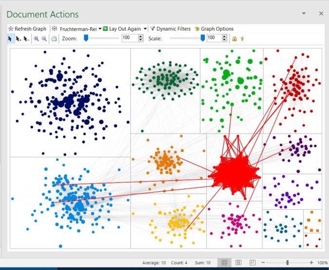
So, when I highlight the turquoise group, what do I find? Connections to most every group of matches my dad has — except for the navy blue group. Which is kinda cool — but so what? Unless you know something about the matches within the group.

So, the matches in the highlighted group above are all kin to my dad’s great-grandfather, Archibald Lamburth (born c. 1833 Tennessee – died 1909 San Francisco). He has the distinction of being my dad’s only great-grandparent born in the United States. Given that the bulk of Ancestry’s DNA customers are U.S.-born, and that many with colonial ancestry say they have many thousands of matches, I suspect most of these connections will tie back to 18th-century U.S. and the colonies should I ever break this “brick wall”.
My second surprise was looking at the navy blue group. Other than the one outlier I have yet to explore, all the matches are intra-group matches. This group includes known close relatives of my dad’s maternal side.

My dad has matches to his maternal grandfather‘s side (and his parents AND grandparents), as well as to his maternal grandmother‘s side (and her parents), the clustering algorithm does not distinguish between the two lines — at least based on the current population of matches used.
I may need to do a separate analysis on these particular matches — perhaps bringing down the filter to 15 cM — to see if I can break out that group into Maternal Grandfather and Maternal Grandmother.
Right now, the only useful information is that my dad’s mother’s matches and my dad’s father’s matches are separate. They weren’t related to each other, based on the information we currently have — the above graphs, plus the genealogy I’ve already done.
The next picture, below, shows how some close genetic relatives (> 275 cM shared, in this case 1st cousins 1 generation removed), share matches with other groups. This cluster could be a Dempsey cluster, with ties to Lamburth kin. Which makes sense in my family tree since a Dempsey married a Lamburth.

Notice also that the group is somewhat open, like a child’s scribble. Not everyone within the group is closely connected to everyone else in the group.
An example of a tightly-connected group is below. This is the group with dots in chartreuse green. Right now, I have no idea how they fit into the family tree. It’s pretty much a self-contained group, with minor ties to the Lamburth (dad’s paternal grandmother’s side) group, but nothing significant. Yet.
That was a look at my dad’s clustered Ancestry matches; sometime in the near future, I’ll take a look at my mom’s clustered Ancestry matches using the NodeXL tool.

Pingback: NodeXL Clustering for Mom’s Ancestry matches | Genes and Roots